Matplotlib 教程展示了如何使用 Matplotlib 在 Python 中创建图表。 我们创建散点图,折线图,条形图和饼图。
Matplotlib
Matplotlib 是用于创建图表的 Python 库。 Matplotlib 可用于 Python 脚本,Python 和 IPython shell,jupyter 笔记本,Web 应用服务器以及四个图形用户界面工具包。
Matplotlib 安装
Matplotlib 是需要安装的外部 Python 库。
$ sudo pip install matplotlib
我们可以使用pip工具安装该库。
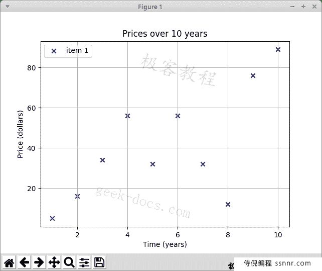
Matplotlib 散点图
散点图是一种图形或数学图,使用笛卡尔坐标显示一组数据的两个变量的值。
scatter.py
#!/usr/bin/python3

import matplotlib.pyplot as plt

x_axis = [1, 2, 3, 4, 5, 6, 7, 8, 9, 10]
y_axis = [5, 16, 34, 56, 32, 56, 32, 12, 76, 89]

plt.title("Prices over 10 years")
plt.scatter(x_axis, y_axis, color='darkblue', marker='x', label="item 1")

plt.xlabel("Time (years)")
plt.ylabel("Price (dollars)")

plt.grid(True)
plt.legend()

plt.show()
该示例绘制了一个散点图。 该图表显示了十年内某些商品的价格。
import matplotlib.pyplot as plt
我们从matplotlib模块导入pyplot。 它是创建图表的命令样式函数的集合。 它的操作与 MATLAB 类似。
x_axis = [1, 2, 3, 4, 5, 6, 7, 8, 9, 10]
y_axis = [5, 16, 34, 56, 32, 56, 32, 12, 76, 89]
我们有 x 和 y 轴的数据。
plt.title("Prices over 10 years")
通过title()功能,我们可以为图表设置标题。
plt.scatter(x_axis, y_axis, color='darkblue', marker='x', label="item 1")
scatter()功能绘制散点图。 它接受 x 和 y 轴,标记的颜色,标记的形状和标签的数据。
plt.xlabel("Time (years)")
plt.ylabel("Price (dollars)")
我们为轴设置标签。
plt.grid(True)
我们用grid()功能显示网格。 网格由许多垂直和水平线组成。
plt.legend()
legend()功能在轴上放置图例。
plt.show()
show()功能显示图表。
两个数据集
在下一个示例中,我们将另一个数据集添加到图表。
scatter2.py
#!/usr/bin/python3

import matplotlib.pyplot as plt

x_axis1 = [1, 2, 3, 4, 5, 6, 7, 8, 9, 10]
y_axis1 = [5, 16, 34, 56, 32, 56, 32, 12, 76, 89]

x_axis2 = [1, 2, 3, 4, 5, 6, 7, 8, 9, 10]
y_axis2 = [53, 6, 46, 36, 15, 64, 73, 25, 82, 9]

plt.title("Prices over 10 years")

plt.scatter(x_axis1, y_axis1, color='darkblue', marker='x', label="item 1")
plt.scatter(x_axis2, y_axis2, color='darkred', marker='x', label="item 2")

plt.xlabel("Time (years)")
plt.ylabel("Price (dollars)")

plt.grid(True)
plt.legend()

plt.show()
该图表显示两个数据集。 我们通过标记的颜色来区分它们。
x_axis1 = [1, 2, 3, 4, 5, 6, 7, 8, 9, 10]
y_axis1 = [5, 16, 34, 56, 32, 56, 32, 12, 76, 89]

x_axis2 = [1, 2, 3, 4, 5, 6, 7, 8, 9, 10]
y_axis2 = [53, 6, 46, 36, 15, 64, 73, 25, 82, 9]
我们有两个数据集。
plt.scatter(x_axis1, y_axis1, color='darkblue', marker='x', label="item 1")
plt.scatter(x_axis2, y_axis2, color='darkred', marker='x', label="item 2")
我们为每个集合调用scatter()函数。
Matplotlib 折线图
折线图是一种显示图表的图表,该信息显示为一系列数据点,这些数据点通过直线段相连,称为标记。
linechart.py
#!/usr/bin/python3

import numpy as np
import matplotlib.pyplot as plt

t = np.arange(0.0, 3.0, 0.01)
s = np.sin(2.5 * np.pi * t)
plt.plot(t, s)

plt.xlabel('time (s)')
plt.ylabel('voltage (mV)')

plt.title('Sine Wave')
plt.grid(True)

plt.show()
该示例显示正弦波折线图。
import numpy as np
在示例中,我们还需要numpy模块。
t = np.arange(0.0, 3.0, 0.01)
arange()函数返回给定间隔内的均匀间隔的值列表。
s = np.sin(2.5 * np.pi * t)
我们获得数据的sin()值。
plt.plot(t, s)
我们使用plot()功能绘制折线图。
Matplotlib 条形图
条形图显示带有矩形条的分组数据,其长度与它们代表的值成比例。 条形图可以垂直或水平绘制。
barchart.py
#!/usr/bin/python3

from matplotlib import pyplot as plt
from matplotlib import style

style.use('ggplot')

x = [0, 1, 2, 3, 4, 5]
y = [46, 38, 29, 22, 13, 11]

fig, ax = plt.subplots()

ax.bar(x, y, align='center')

ax.set_title('Olympic Gold medals in London')
ax.set_ylabel('Gold medals')
ax.set_xlabel('Countries')

ax.set_xticks(x)
ax.set_xticklabels(("USA", "China", "UK", "Russia",
    "South Korea", "Germany"))

plt.show()
该示例绘制了条形图。 它显示了 2012 年伦敦每个国家/地区的奥运金牌数量。
style.use('ggplot')
可以使用预定义的样式。
fig, ax = plt.subplots()
subplots()函数返回图形和轴对象。
ax.bar(x, y, align='center')
使用bar()功能生成条形图。
ax.set_xticks(x)
ax.set_xticklabels(("USA", "China", "UK", "Russia",
    "South Korea", "Germany"))
我们为 x 轴设置国家/地区名称。
Matplotlib 饼图
饼图是圆形图,将其分成多个切片以说明数值比例。
piechart.py
#!/usr/bin/python3

import matplotlib.pyplot as plt

labels = ['Oranges', 'Pears', 'Plums', 'Blueberries']
quantity = [38, 45, 24, 10]

colors = ['yellowgreen', 'gold', 'lightskyblue', 'lightcoral']

plt.pie(quantity, labels=labels, colors=colors, autopct='%1.1f%%',
    shadow=True, startangle=90)

plt.axis('equal')

plt.show()
该示例创建一个饼图。
labels = ['Oranges', 'Pears', 'Plums', 'Blueberries']
quantity = [38, 45, 24, 10]
我们有标签和相应的数量。
colors = ['yellowgreen', 'gold', 'lightskyblue', 'lightcoral']
我们为饼图的切片定义颜色。
plt.pie(quantity, labels=labels, colors=colors, autopct='%1.1f%%',
    shadow=True, startangle=90)
饼图是通过pie()功能生成的。 autopct负责在图表的楔形图中显示百分比。
plt.axis('equal')
我们设置了相等的长宽比,以便将饼图绘制为圆形。
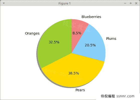
Figure: Pie chart
在本教程中,我们使用 Matplotlib 库创建了散点图,折线图,条形图和饼图。
您可能也对以下相关教程感兴趣: PrettyTable 教程,SymPy 教程,Python 教程。